![Light Priority - Photography by Rory Prior]](https://lightpriority.net/wp-content/uploads/2020/05/fulllogo.png)

People often ask me if I’ve gotten any good shots when I’m out taking photos – it’s a question I often find a little hard to answer. Aside from being a fairly modest person, I often don’t quite know how well a photo has turned out until I’ve seen it on a big screen and done a little editing. I shoot RAW and I like to process my images to increase the dynamic range a bit, make the colours more punchy and generally tweak things until it looks right to me. Sometimes shots which I think look great in camera turn out to be duds and sometimes, with a bit of editing, a shot that I initially think is lacklustre can turn out quite special. I thought it would be fun to share a few before and afters to show how I derive some my images. I do about 90% of my editing in Lightroom. For the remaining 10%, I use a mixture of Photoshop CS4 and Color Efex Pro 2. I’m also starting to experiment with Analog Efex Pro 2, which can do some lovely effects, but makes it easy to overdo things.

[exif id=”680″]
Here’s a fairly bland shot of some ema boards at a shrine in Kyoto. The dappled light is quite nice, but overall this isn’t a great image, it’s a bit wonky, the composition is rather unfocused, the highlights are blown and everything is a bit flat looking.
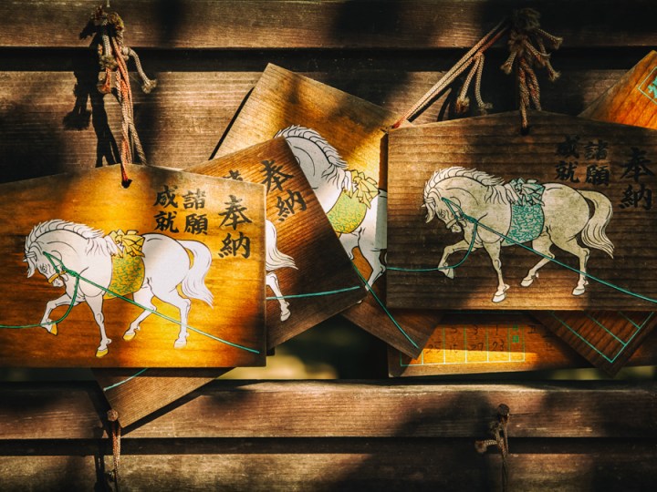
After some work in Lightroom, Analog Efex Pro 2 and Photoshop I got this result which I’m rather pleased with. A tighter crop has helped focus the image, pumping the saturation and toning the shadows has helped improve the bland feeling of the light, adding a sense of warmth and late evening sunlight. A little careful masking, and blurred noise in Photoshop has fixed the burnt out area on the lefthand ema, although it’s a little hard to see at this size. It looked wrong darkening it too much.

[exif id=”683″]
Another Japan shot, this time from Kawagoe. My old Nikon D7000 had terrible metering and often over exposed skies as you can see here. Overall I quite like the composition, but it could use a bit of tightening up and the removal of some the superfluous elements like that white post on the left. The shadow areas are bit dark too and could use lifting.
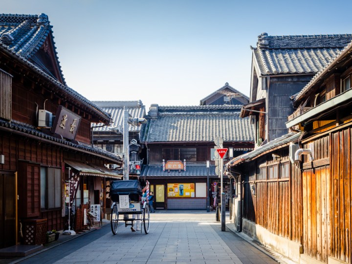
A slight crop removes that distracting post on the left side and loses a bit of the featureless panelling on the right. I’ve done quite a bit of work on the sky as you can see, adding back some of the blue using the graduated filter in Lightroom with a little shift in white balance to bring out the blue. I’ve warmed up the colours and brought up the saturation to bring out those wonderful hues in the wooden panels. I decided the people standing in front of the barbershop were detracting a little from the center of the photo, which is where the perspective naturally leads your eyes, so I took them out in Photoshop and reconstructed the obscured elements.
[exif id=”685″]
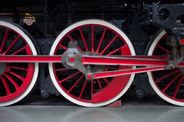
I carefully composed this shot, so even without any editing things are nicely straight and lined up how I want them. That bright logo in the background is eye catching though and the light grey floor also draws your eye a bit too much. Both of these are unavoidable elements which I couldn’t work around at the time of shooting, so it’s into the digital darkroom to make some alterations…
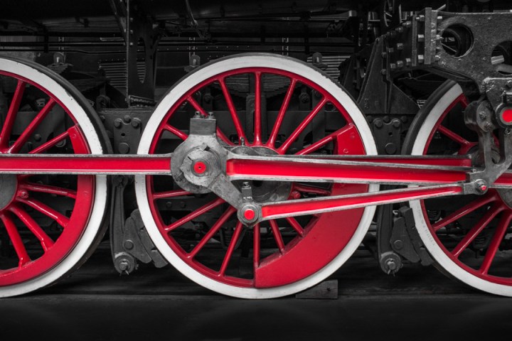
I decided to selectively colour the image, desaturating everything apart from the red. Not that there was much other colour anyway, but it helped to create a uniform look. I darkened the floor with a graduated filter and edited out the old British Railways logo that was visible in the background. I used the spot healing tool to remove quite a few minor blemishes. The end result is a nicely balanced image with a good sense of symmetry.
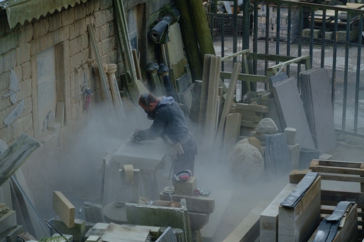
[exif id=”687″]
When I took this shot I could really have used a longer lens (that 90mm f2 can’t come soon enough Fuji!). The subject is a bit lost in the clutter, the light is rather flat and stone dust is making things look very murky.
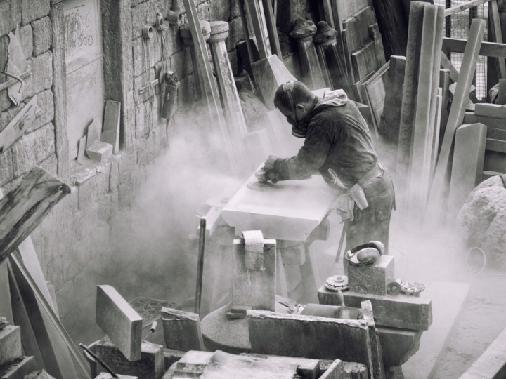
I shot this with my camera in the black and white film simulation and once in Lightroom I developed the RAW as a black and white image. Black and white is great for subjects where the light is flat and there isn’t much colour to work with, it lets you really pump up the contrast and definition without making the image look awful. I’ve cropped the image down quite a bit to place the stone mason on a third line and minimise the surrounding clutter. Further processing in Color Efex Pro helped to bring out the details in the dust cloud, adding more drama to the image. I’ve also subtly toned it, bringing in a little warmth to reflect the warm hues of the local stone and to add a slightly old-timey look.
I hope you’ve enjoyed this behind the scenes look at how I do some of my editing. If you’d like to support my work please take a look at my shop on Light Priority or Etsy and consider buying a print.


